Amino Colorway
January 22, 2018 | 13 minute read
One of the first large refactors I focused on when building out Amino was our color system. Over the years, not only had we failed to manage our colors with Sass or JS variables, we had also added colors ad-hoc - most of the time using HEX values directly in inline or Sass styling. It wasn't maintainable, and it was time to wrangle these colors.
👋 This project is from my time at Transcriptic. Before you get going, you might check out this quick primer on Transcriptic and Strateos.
Requirements
Before diving into this project, I wanted to make sure I knew where I was going. To guide my work, I documented a simple set of requirements:
The Amino Color palette must...
- be context agnostic. Amino Colors may be used in dark or light UIs, and on a variety of screen types.
- be flexible. Designers will use Amino Colors to create app-specific UI components, layouts and designs and will need a broad selection of colors to draw from.
- be cohesive. While the Amino Colors need to provide flexibility to designers, they also need to communicate a cohesive brand and design identity.
- be extensive. To promote the use of Amino Colors by designers, a broad selection of colors must be provided.
Process
Audit
The first step was to document all the colors used across the Transcriptic products. This was a fairly simple task. With some simple regexes, I pulled out all RBG, HSL and HEX values in each repository.
I compiled all of the colors I found from the audit into an Illustrator file with swatches for each result. Then I began the process of grouping the swatches to define the categories of colors we use in our products.
Refining
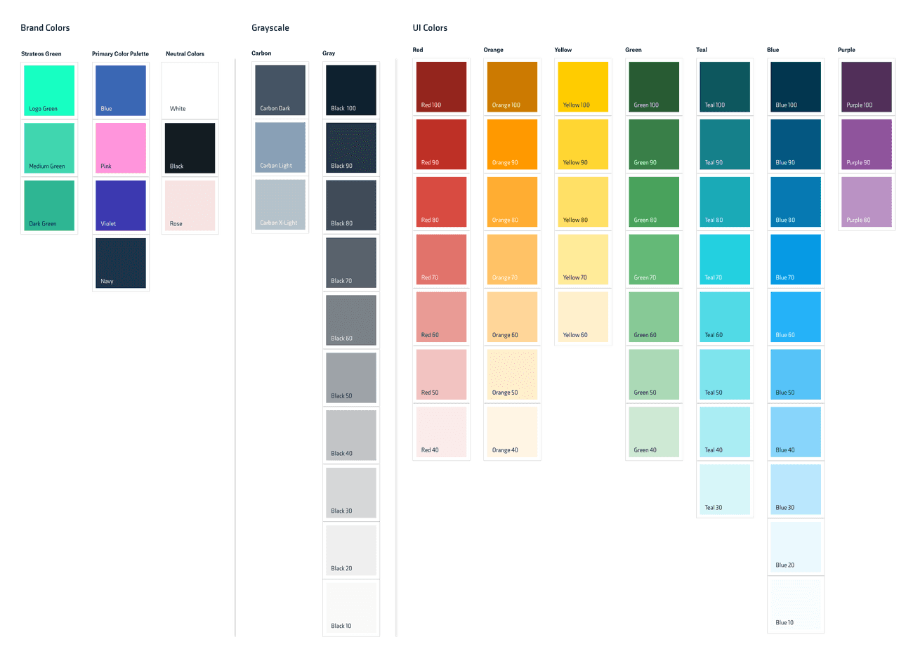
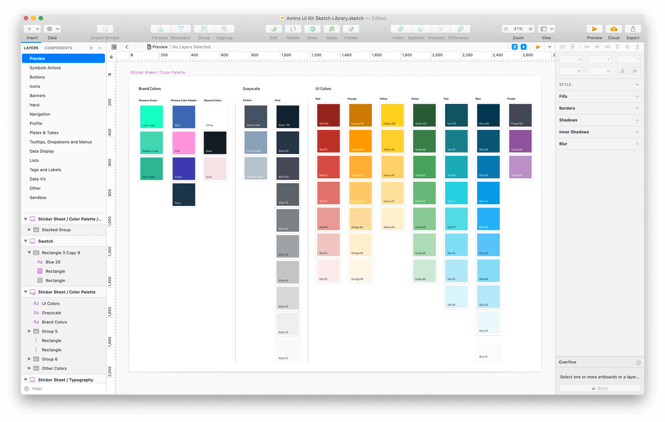
The colors fell into three categories:
- Brand Colors
- Gray Scale
- UI Accents
From this large collection of colors, I began the process of narrowing them down to only what was needed.
Useful Resources
Two books were a huge influence for this process: Interaction of Color by Josef Albers and Visual Strategies: A Practical Guide to Graphics for Scientists and Engineers by Felice C. Frankel and Angela H. DePace.
Interaction of Color helped me work out which colors were necessary for pleasing contrasts and compositions, and how fewer colors could be used to create a wider variety. Visual Strategies helped me work out where in the UI color might need to be added, and where it might be taken away. These processes helped me cull the list of audited colors down to only those that were necessary.
Colorway Definition
Brand Colors
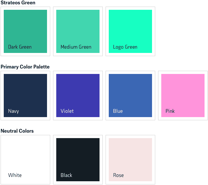
The most obvious colors to include in the Amino colorway were our brand colors - which had been defined by the design firm who did our initial branding.
These I broke down into three categories, to make it more clear when and how each should be used. I designated our primary Green scale for primary actions such as buttons, and to indicate active state.
Then, I left our secondary and neutral brand colors for use as accents and decorative colors throughout our designs.
Gray Scale
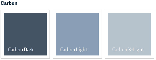
The next clear category of colors were grays. For the most part, the grays from my audit were all over the map. I arrived at two scales that met most of our needs: a "Carbon" tinted one that hued towards blue, and a strictly gray scale with ten steps ranging from nearly black to nearly white.
I found a need for the blue-tinted Carbon scale in our typography, where we used subdued colors for secondary text that simultaneously maintained more visual character than strict gray.
Beyond the slim Carbon scale, there was a clear need from our UI for a wide variety of basic grays for use in drop-shadows, borders, dividers and other visual delineators. However, creating a simple grayscale isn't so simple. To begin with, we must consider how well the human eye can discern between varying shades of gray.
At any given time, the eye can only see a range of 1000:1, or about 10 stops of light. This range is called the Dynamic Contrast Range or simply Dynamic Range – since its value changes over time. Dynamic Range of the Human Eye
Where on the scale from bright to dark those ten stops fall depends on the context of the overall scene.
In bright scenes the iris (which regulates the size of the pupil) closes down and enables the perception of detail in bright areas, but simultaneously restricts our ability to see dark shades. In dark scenes the eyes iris opens up dramatically and improves the ability to see in the dark, but simultaneously limits the perception of bright detail. Light Intensity and Dynamic Range
To further complicate the matter, Interaction of Color tells us that
...the eye distinguishes better the so-called middle greys.
So, putting it all together, depending on how bright a given UI is, the eye will be able to see contrast on the dark, or light end of the brightness spectrum, but not both. Furthermore, across the entire scale, the eye is best equipped to perceive contrast in the middle.
Since a requirement for the Amino Color palette is compatibility with both dark and light UIs, the gray scale will need to offer a large selection of light and dark grays. I decided to provide ten grays in the scale — more than enough to cover the vast majority of use cases. A simple approach here would be to sample uniformly across the white to black gradient, like so:
Sample Curve: x1.00
Given what we learned above, and that the design of the website you're reading this on is bright, we can make out the separate bright and middle grays of the scale, but the darker blacks are difficult to tell apart. It would be great to have contrast between all members of the scale on any color background — as this will make the scale more useful to designers.
A more complex approach than a simple uniform sampling would be to sample more grays towards the middle of the spectrum, where the human eye excels, and fewer at the extremes – allowing for more difference in brightness between light and dark grays:
Sample Curve: x2.00
This example uses an exponential curve for sampling, meaning that as we move away from the middle of the spectrum, each sample gets exponentially darker or lighter. As we can see, we get far better contrast on the darks, and even better contrast on the lights. However, the middle is fairly hard to tell apart. A softer sampling curve is needed.
In this interactive example, we start with an exponent of 1.6, however play with the slider to see for yourself what different exponent values look like.
Sample Curve: x1.60
This is a good start for a scale, however for aesthetics I wanted to limit the extremes of the scale away from pure white and black. To bring the tails in but keep reasonable contrast, it was necessary to soften the curve just a bit to an exponent of 1.55. Here's that same scale again, but with those modifications.
Sample Curve: x1.55
Finally, we have a grayscale that maintains good contrast in the light, middle and dark regions on dark and light backgrounds. Whew! As a final touch, this scale just seems a bit dull, and Interaction of Color shows us that there's more we can do to add some contrast.
It has been seen that color differences are caused by 2 factors: by hue and by light, and in most cases by both at the same time.
Drawing from this suggestion, I decided to add some additional contrast with a very slight blue hue. The result is this final scale!
We've been shipping this scale in Amino for several years now and it's been quite successful. We see no custom grays cropping up in our designs or code bases, indicating that these values meet our product design needs.
UI Colors
Oddly enough, developing our grayscale was the most difficult part of this process. Developing our color scales was simpler, requiring me to identify which hues Amino needed to support, and then defining the necessary shades for each hue. For each hue, I reduced the number of shades down to the smallest possible number.
I anticipated designers using Amino would have an innumerable number of uses for color, however I used our existing products as a guide for what colors were most useful. A core goal of Amino is to help designers create UIs that visually align with our full suite of products, and colors are a great tool for achieving that. By providing more shades for some hues, and fewer for others, we're able to guide a designer's color choices.
From my color audit, the most commonly used hue in the most shades by far was blue. This neutral color is extremely useful for many UI accents such as hover-states, highlights and buttons. As a result, the blue scale contains ten shades — more than any other hue.
Second after blue was teal in terms of usage. It stood out as another neutral color that works well for labels and notifications that shouldn't convey status. Eight shades seemed to cover all reasonable uses for teal. I slanted the scale towards darker shades, as there were no documented uses of light teal.
With the neutral hues accounted for, the next most common shades were ones associated with status. I wanted to make sure that green, orange and red were equally represented in Amino, allowing designers to create equally balanced status components.
Yellow had limited representation in my color audit. There were no uses of dark yellows, so I slanted this limited scale towards the lighter side.
Finally, a limited, but useful color found in my audit was purple, so a very slim purple scale, with darker, medium and lighter shades, rounds out our palette.
Text Contrast
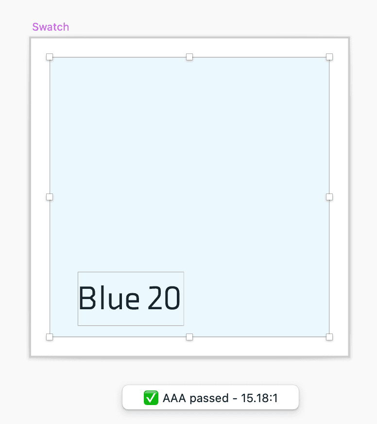
The final step of this process was to provide guidance on accessibility to designers. Contrast is one of the most important accessibility considerations for designers, and it is helpful to know if a given color has accessible contrast with black or white.
To guide designers in this regard, I used a color contrast analyzer on every color in the palette, and documented the appropriate text color for each. You'll see in the scales above that some swatches have the name defined in white text, and others in black — indicating if the color contrasts with dark or light colors.
The Final Palette
With our color scales fully defined, I produced a final Color Palette in Illustrator which I distributed via Adobe Creative Cloud so that the design team can centrally maintain the colors. Finally, and most critically, I added the full color palette to the Amino Sketch Library.
Implementation
After defining the color palette, it was time to determine how to implement it in code. I wanted to expose the colors both as Sass variables, and as JS variables – giving engineers no excuse not to use Amino's provided colors.
Explicitly Defined Values
To begin with, the brand colors, and grayscale colors were defined explicitly as HEX values:
// Strateos Green
$str-green--logo: #17FFC2;
$str-green--medium: #41D6AF;
$str-green--dark: #2FB693;

// Primary Palette
$str-blue: #3B67B4;
$str-pink: #FF94DB;
$str-violet: #3D3AB0;
$str-navy: #1D304E;

// Neutral Colors
$str-black: #151D23;
$str-white: #FFFFFF;
$str-rose: #F6E4E3;

// Strateos Carbon
$str-carbon: #445464;
$str-carbon--light: #8A9FB6;
$str-carbon--x-light: #B6C3CC;

// Strateos Black/Grayscale
$str-black: #0E212F;
$str-black--90: #2A3642;
$str-black--80: #414C58;
$str-black--70: #59626C;
$str-black--60: #7A8187;
$str-black--50: #9EA3A8;
$str-black--40: #C2C4C6;
$str-black--30: #D6D7D8;
$str-black--20: #EFEFEF;
$str-black--10: #F9F9F9;
Mathematically Defined Values
When initially crafting the color scales, I generated each hue mathematically, allowing the scales to be evenly distributed. This approach was doubly useful when translating into code. I was able to start from a root hue, saturation and lightness value for each color, and increment or decrement the lightness from there:
@function lightenHSL($hue, $sat, $lum, $increase) {
  @return lighten(hsl($hue, $sat, $lum), ($increase * 10));
}

@function darkenHSL($hue, $sat, $lum, $increase) {
  @return darken(hsl($hue, $sat, $lum), ($increase * 10));
}

// Purple
$purple-hue: 289;
$purple-sat: 30%;
$purple-lum: 47%;
$purple--100: darkenHSL($purple-hue, $purple-sat, $purple-lum, 2);
$purple--90: hsl($purple-hue, $purple-sat, $purple-lum);
$purple--80: lightenHSL($purple-hue, $purple-sat, $purple-lum, 2);

$purple: $purple--90;
The root color is exposed not only as a member of its scale, but also as a stand-alone variable name, in this case $purple. This helps designers understand which member of a scale is intended to be the default, and helps to make it apparent if a given shade is "dark" or "light". After all, as Josef Albers tells us...
Color is the most relative medium in art.Interaction of Color
Exposing Appropriate Contrast
Next, we need a way to help engineers automatically determine if a color contrasts on dark or light backgrounds. To achieve this, I returned to the color shades I documented in Sketch, and reflected them in Sass maps exposed as variables:
$purples: (
  'purple--100': (color: $purple--100, text: $white),
  'purple--90': (color: $purple--90, text: $white),
  'purple--80': (color: $purple--80, text: $tx-black)
);
Using this Sass Map, engineers can retrieve any color, and its associated text color:
$purple100color: map.get(map.get($purples, purple--100), color);
$purple100text: map.get(map.get($purples, purple--100), text);
From Sass to JS
Finally, while Sass is a nice tool for managing and manipulating colors, I want to ensure that engineers have access to colors in Javascript as well. Luckily, we build Amino with Webpack, and Webpack makes exporting Sass variables to Javascript super easy! To begin with, we have to expose one final bit of Sass:
:export {
  purple: $purple;
  purple100: $purple--100;
  purple90: $purple--90;
  purple80: $purple--80;
}
Then, when Webpack's sass-loader reads this file, it will make these keys and values accessible and JS variables like so:
import * as Colors from from 'colors.scss';

<p style={{ color: Colors.purple100 }}>Purple Rain</p>
In Conclusion
Starting off on this effort, I really didn't think this project would become so enormous. However the time put into it has paid dividends, as our color system has stood the test of time. For several years it has been used by many designers and even more engineers. Each has found that the system meets their needs and provides the necessary colors to bring their visions to life.
Going forward, I would like to actually slim this color palette down even further — however doing so would require design refactors of our existing products. A challenge for another time...
