Amino Typography
January 22, 2018 | 6 minute read
When I began the process of defining the typography for Amino, we had no existing typography systems documented outside of code. Furthermore, our typography CSS styling was a mix of several attempts at wrangling our type over the years. In short, we needed to start from scratch and put forth a single source of truth inside of Amino.
👋 This project is from my time at Transcriptic. Before you get going, you might check out this quick primer on Transcriptic and Strateos.
Requirements
Kicking off this effort, I wanted to have some clear goals to guide my work. For the most part, I borrowed from the Amino Colorway requirements:
The Amino Typography system must...
- be context agnostic. Amino Typography must be compatible with dark or light UIs, and usable on a variety of screen types.
- be flexible. It's impossible to predict all of the future typography needs of designers using Amino, so the system will need to adapt to their needs.
- be cohesive. The Amino Typography needs to help communicate a cohesive brand and design identity through type.
- be extensive. To promote the use of Amino Typography by designers, the system needs to encompass as many use cases as possible.
State of the World
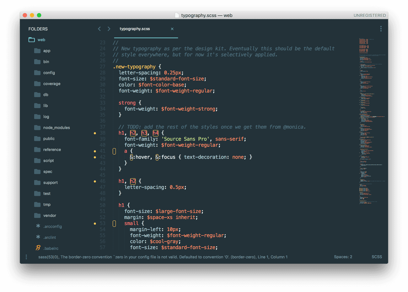
At the start of this effort, our typography styling code was twisted into knots — meaning that our UI lacked any sense of typographic consistency. Our products drew on a broad collection of typographic systems, from Bootstrap to home-grown ones, including one gated by a .new-typography CSS class... 🤦🏻♂️
Process
Attempting any sort of audit would be somewhat fruitless, so instead I dove in and started from scratch. Before getting into the details, I needed to decide on a scale.
Scale
I knew that there was no reason to re-invent the wheel on our typography. To begin, I settled on the standard 16px base font size. When deciding how I wanted to scale up and down from this base, I knew that I wanted a system I could compute in code, instead of managing manually.
My first challenge was determining how the scale would expand and contract. For sizes smaller than 16px, I wanted the chose to shrink linearly, for an even downwards progression. For the larger sizes, I decided to scale exponentially, so that each step up in the scale grew by more than the last.
Working from these decisions, I chose a universal multiplier of 0.125 that would be applied differently moving up and down the scale. The result was quite pleasing.
After defining this scale in our Sketch library, I went about implementing it in Sass as follows:
/*
  For a given multiplier, return a font size from the scale.
  A multiplier of 0 will return 1rem, or 16px
*/
@function str-typescale($multiplier) {
  $base-scale: 0.125;
  $font-size: undefined;

  /* Allow the keyword "inherit" to be provided. */
  @if ($multiplier == inherit) {
    $font-size: inherit;
  } @else {
    /* If the provided multiplier is not an integer, throw an error. */
    @if (round($multiplier) != $multiplier) {
      @error 'Error in `str-typescale. `#{$multiplier}` is not an integer.';
    }

    /* Set default font size. */
    $font-size: 1rem;

    /* For sizes smaller than the base font, use the smaller scale */
    @if ($multiplier < 0) {
      /* Multiplier of -2 will subtract 2*0.125 from 1rem. */
      $font-size: (1rem + ($base-scale * $multiplier));
    }

    /* For sizes larger than the base font, use the larger scale */
    @if ($multiplier > 0) {
      /*
        Multiplier of 2 will return 16px*(1.125^2) = 20.25px
        This is then rounded to 20px and divided by 16px to
        convert back to 1.25rem
      */
      $size: round($base-font-size * pow((1+$base-scale), $multiplier));
      $font-size: #{($size / $base-font-size)}rem;
    }
  }

  @return $font-size;
}
Using this Sass function, it was simple to quickly define font sizes for HTML text tags:
h3 {
  font-size: str-typescale(4);
}
Styles and Variants
Weight and Color
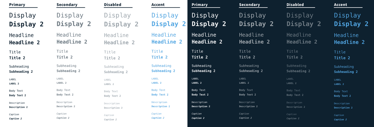
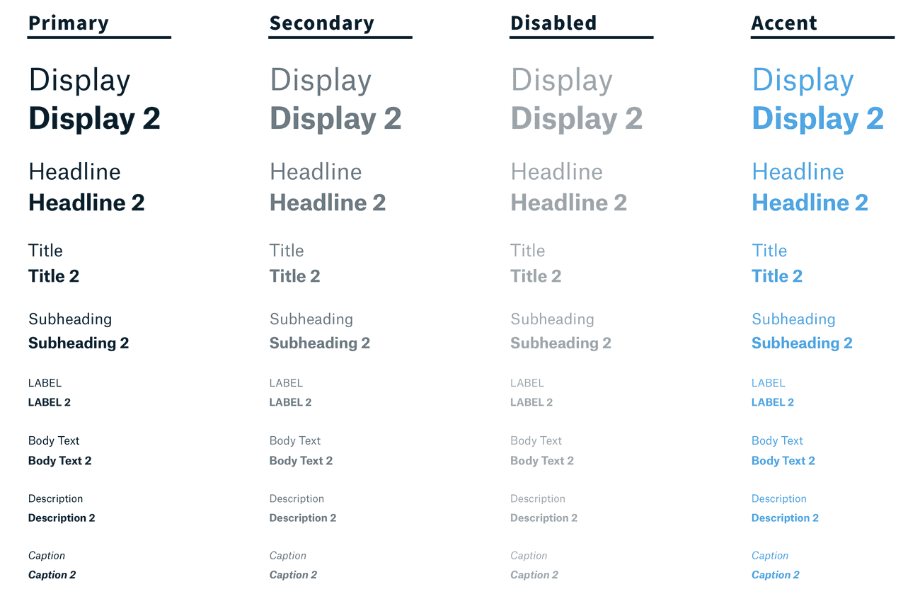
Using this scale, I developed 8 key text styles that each served a unique UI purpose. For each style, I developed a heavy and light variation, as well as four color variations.
Background Contrast
Weight and color provide a lot of flexibility and extensibility, however the text colors shown above do not stand out against dark backgrounds. I wanted to provide default text colors in the system, so I developed an inverse color scheme for use on dark backgrounds.
Fonts
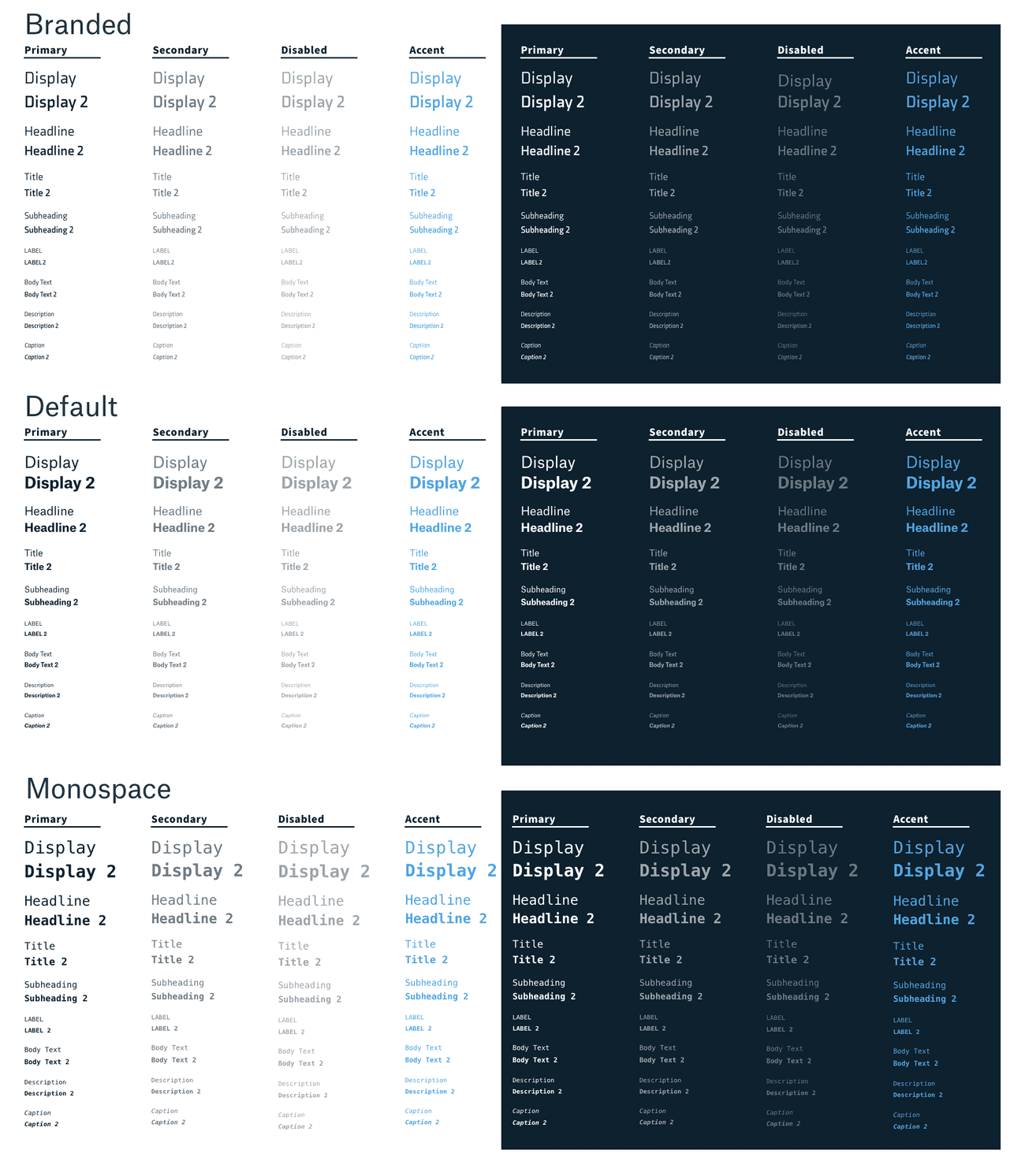
Finally, we wanted to allow designers to move between a small selection of typefaces in their designs. I defined the following options:
- Default: Sets the type to Strateos's body font, Atlas.
- Branded: Sets the type to our Strateos brand font of Axia.
- Monospace: Sets the type to a monospace typeset of Monaco, Menlo, Consolas, and finally Courier New.
All told, the final result came out as follows:
Implementation
I wanted to make lookup and maintenance of the many details contained in this system as simple possible, so I structured all of the information within Sass maps, and made it accessible through a Mixin:
$typography-colors: (
  primary: $str-black,
  secondary: transparentize($str-black, 0.4),
  disabled: transparentize($str-black, 0.6),
  accent: $blue,
  warning: $orange,
  error: $red,
  success: $green
  invert: (
    primary: $white,
    secondary: transparentize($white, 0.4),
    disabled: transparentize($white, 0.6),
  )
);

$typography-styles: (
    display: (
      size: 6,
      weight: (
        default: $font-weight-regular,
        heavy: $font-weight-semibold
      ),
      font-style: normal,
      text-transform: none
    ),
    headline: (
      size: 5,
      weight: (
        default: $font-weight-regular,
        heavy: $font-weight-semibold
      ),
      font-style: normal,
      text-transform: none
    ),
    //... and so on...
);

@mixin typography($style, $invert: false, $tier: primary, $weight: default) {
  font-size: str-typescale(map-get(map-get($typography-styles, $style), size);
  font-weight: str-typescale(map-get(map-get(map-get($typography-styles, $style), weight), $weight);
  font-style: str-typescale(map-get(map-get($typography-styles, $style), font-style);
  text-transform: str-typescale(map-get(map-get($typography-styles, $style), text-transform);
  @if ($invert) {
    color: map-get(map-get($typography-colors, invert), $tier);
  } @else {
    color: map-get($typography-colors, $tier);
  }
}
Now, this Mixin allows us define the style for a tag in a single line:
h3 {
  @include typography(title, false, primary, heavy);

  &.invert {
    @include typography(title, true, primary, heavy);
  }
}
Spacing
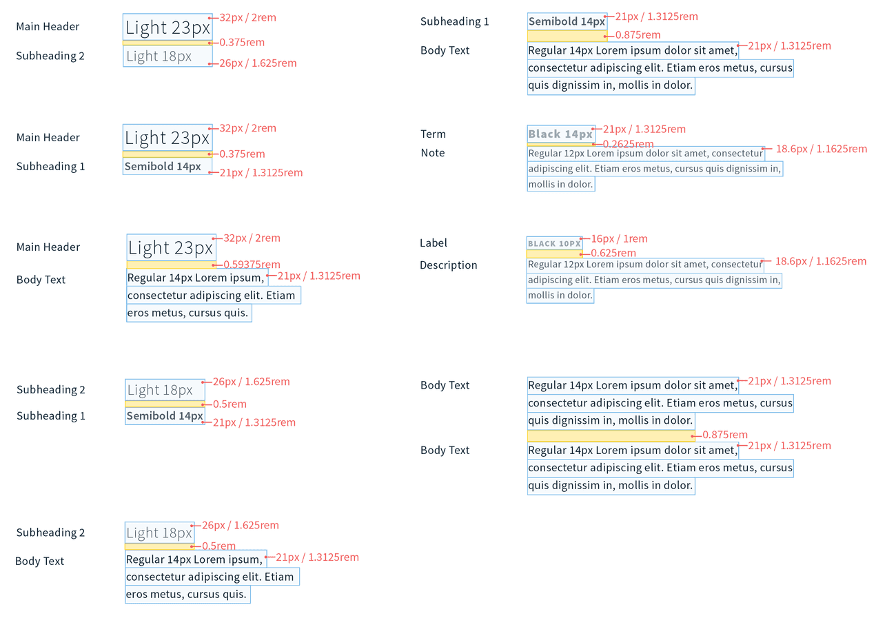
With a full specification for text styles, some basic spacing rules were necessary. I rolled these details into the Sass mixin defined above, allowing them to be applied automatically to text tags and class names.
Bringing It To Life
Refactoring the applications that consumed this text styling was a long process. The first step was to rip off the bandaid and remove Bootstrap typography. We had been relying on various aspects of Bootstrap to fill in styling holes. Removing this dependency reduced the size of our styling code drastically, and revealed all of the areas that were now ill formatted.
I also removed the old typography system that had been only partially implemented. From here, I completed manual audits and walkthroughs to find areas that did not inherit the appropriate styling based on HTML tags alone.
All told, the process took a week or so, and in the end, we had a clear, consistent typographic system. Feedback was overwhelmingly positive. Most users, internal and external, recognized that the text in the app became more legible and consistent. Some even called it sexy!
Since its inception, this typography system has proved resilient, needing very few updates. When updates were necessary, the changes could be applied across the entire app at once - a substantial benefit to both our users, and our engineering team.
