Amino Design Ops
January 22, 2018 | 15 minute read
A core principle of Amino is that it must reduce the demands placed on both the design and engineering teams. In service of this goal, Amino is integrated from Sketch file to React component with extensive tooling to automate common tasks, and reduce the likelihood of human error.
👋 This project is from my time at Transcriptic. Before you get going, you might check out this quick primer on Transcriptic and Strateos.
The Amino Ecosystem
Amino consists of seven tools, each of which integrate with each other to assist designers and developers in their work.
Sketch
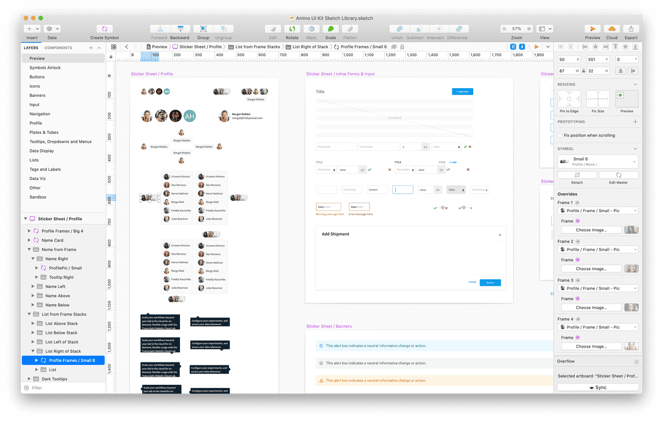
We use Sketch to design and distribute our component designs as a Sketch Library across the Design team using Sketch Cloud.
Fontello
Sometimes our icon font, FontAwesome, just doesn't cut it – even though we love it! So we maintain our own icon font as well – and we use Fontello to build and maintain it.
Zeplin
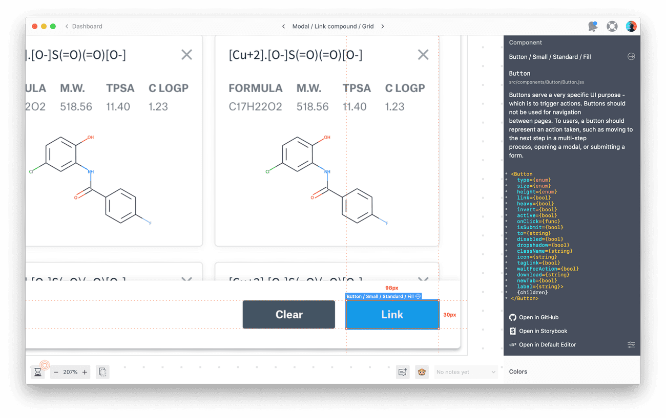
The glue between our Design and Engineering teams is Zeplin. We use the Zeplin CLI and Connected Components to make sure that UI mocks are closely coupled with Amino's React codebase.
React/Sass
The typography, colors, and components defined in our Sketch Library are reflected in code in a React codebase with Sass styling – which is distrbuted as an NPM package.
Storybook
Within our React codebase, we use Storybook to render stories of our components, showing them in different contexts and states. The Storybook development server is a useful sandbox while working on components.
Chromatic
As part of Amino's Continuous Integration, we use Chromatic to test for visual regressions – ensuring that changes to the codebase don't have unintended side-effects. Chromatic takes visual snapshots of our Storybook and flags any anomalies for review by the Design team.
Documentation
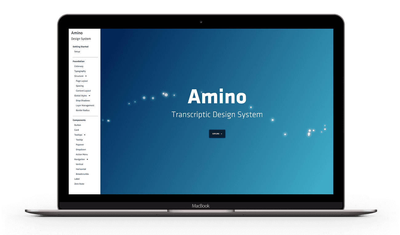
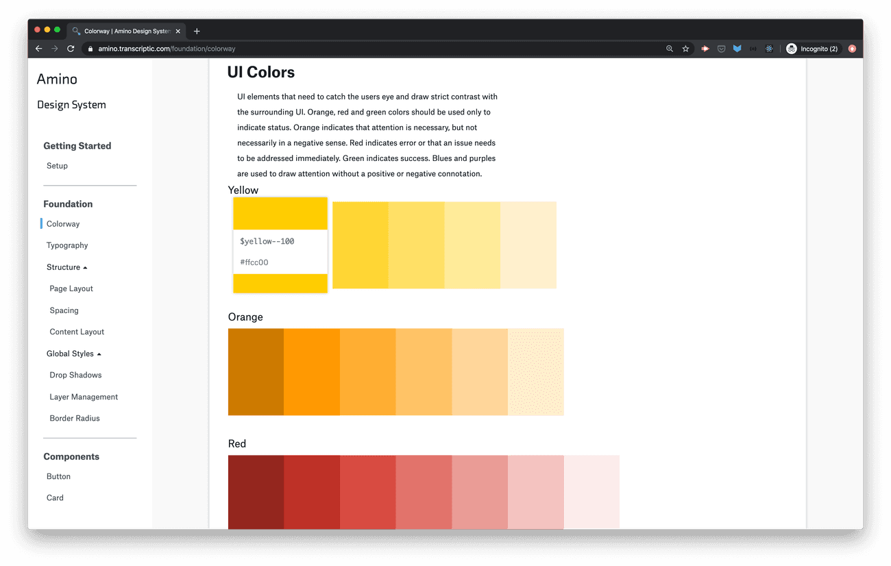
The Amino Documentation Site is built every time a new version of Amino is released. Documentation is parsed out of inline comments from the React components, and paired with interactive demos – allowing users to test different parameter values.
Foundation Design vs. Product Design
The Design Team uses these tools in different ways, depending on whether we are working on foundation design, or production design.
Foundation Design
This includes any design work that is focused on the expansion or improvement of Amino – such as a new component, or improved typography. Our design stack for Foundation Design flows in the following order:
Initial designs are completed in Sketch, before being communicated to engineers team in Zeplin. Engineers work from Zeplin to implement additions or improvements, using Storybook as their point of reference. Finally, their work is tested in Chromatic, to make sure that they have added only intentional visual changes.
Production Design
This work is focused on the improvement of a product, the proposed solution for which draws on Amino. For Product Design, our design stack looks like this:
As before, initial designs and user flows are completed and Sketch and distributed in Zeplin. Thanks to Connected Components, our engineers can see right in Zeplin precisely which components to use while implementing a mock. For additional information on a component, they may turn to the Amino Documentation to see more detailed descriptions of properties. In the end, the final deliverable is always design-reviewed React code.
Building Amino
From the tooling that makes up the Amino ecosystem, a subset is used in the process of improving and maintaining Amino.
Sketch Library
The Amino Sketch Library is the Design Team's most accessible resource for creating mockups. However, since Design maintains the Amino codebase, we consider the coded components as our source of visual truth. This frees up Designers from fretting over mindless pixel adjustments when creating mocks – we shake the details shake out in code.
Fontello
We use FontAwesome Pro for the majority of our icons, however given the scientific nature of Transcriptic's products, we often need icons not provided by FontAwesome. We distribute FontAwesome as part of Amino, and we wanted to provide a similar API to engineers for accessing FontAwesome and our custom icons – so we maintain our own icon font!
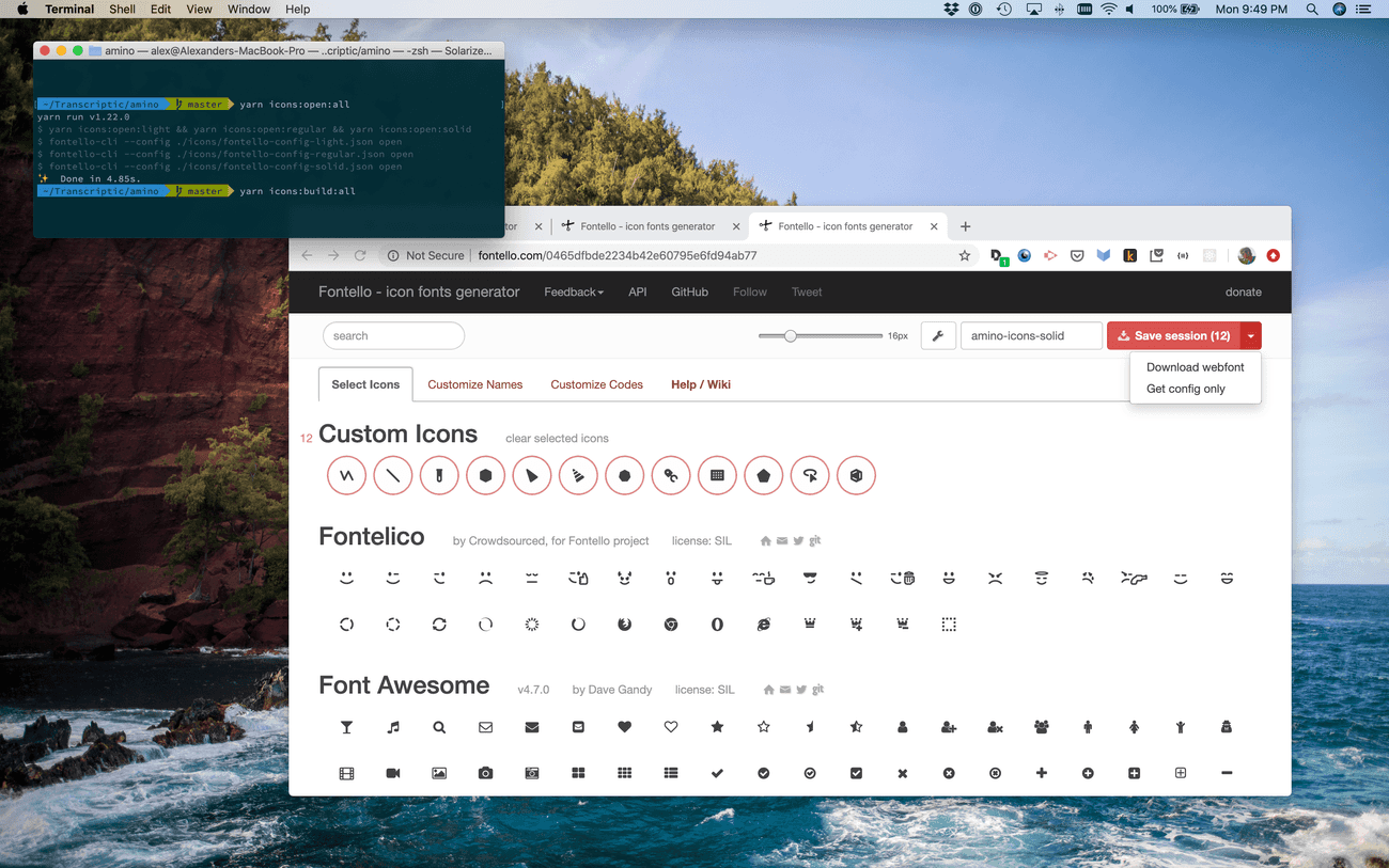
We use Fontello, a web-based service, to generate the CSS and font fils for the Amino Icon Font. To automate the font's maintenance as much as possible, we leverage the Sketch and Fontello APIs.
Sketch API Integration
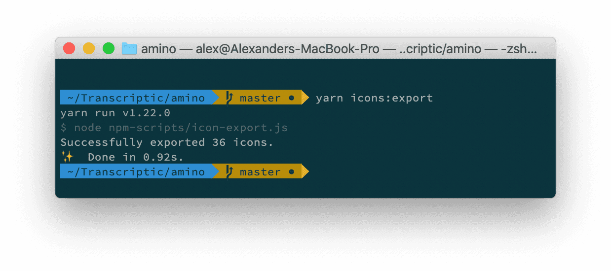
When a designer wants to add a new icon, or modify an existing one, they begin in the Icon Font Sketch file – and place their finished work in the Published page. Then, they run a Node script exposed in Amino's package.json to automagically export all of the icons from Sketch to SVGs in the Amino repository.
Fontelli API Integration
With the icon SVGs exported for use, we can now use the Fontello API to automatically load the existing icon font in the Fontello web-app.
- We use a Yarn script and the
fontello-cli opencommand to open three Fontello webapp instances, each loaded with either the Light, Regular, or Solid weight of our icon font. - In these tabs, the Designer uploads SVGs exported from Sketch of any new icons.
- Then, the designer downloads the JSON config file for each weight to their local Amino repository.
- Finally, the designer generates and builds new icon font files and accompanying CSS files with a Yarn script that uses the
fontello-cli installcommand.
Using the Icon Font
We distribute our icon font within Amino alongside FontAwesome – so developers can use both in much the same way. They just use our icon font's class names, instead of FontAwesome's:
// FontAwesome Bolt Icon in Light Weight
<i className="fal fa-bolt" />

// Amino Plate Icon in Light Weight
<i className="aminol-plate" />
Zeplin
In the process of improving and maintaining Amino, we use Zeplin to collect and document the components and styles defined in our Sketch Library.
Styleguides
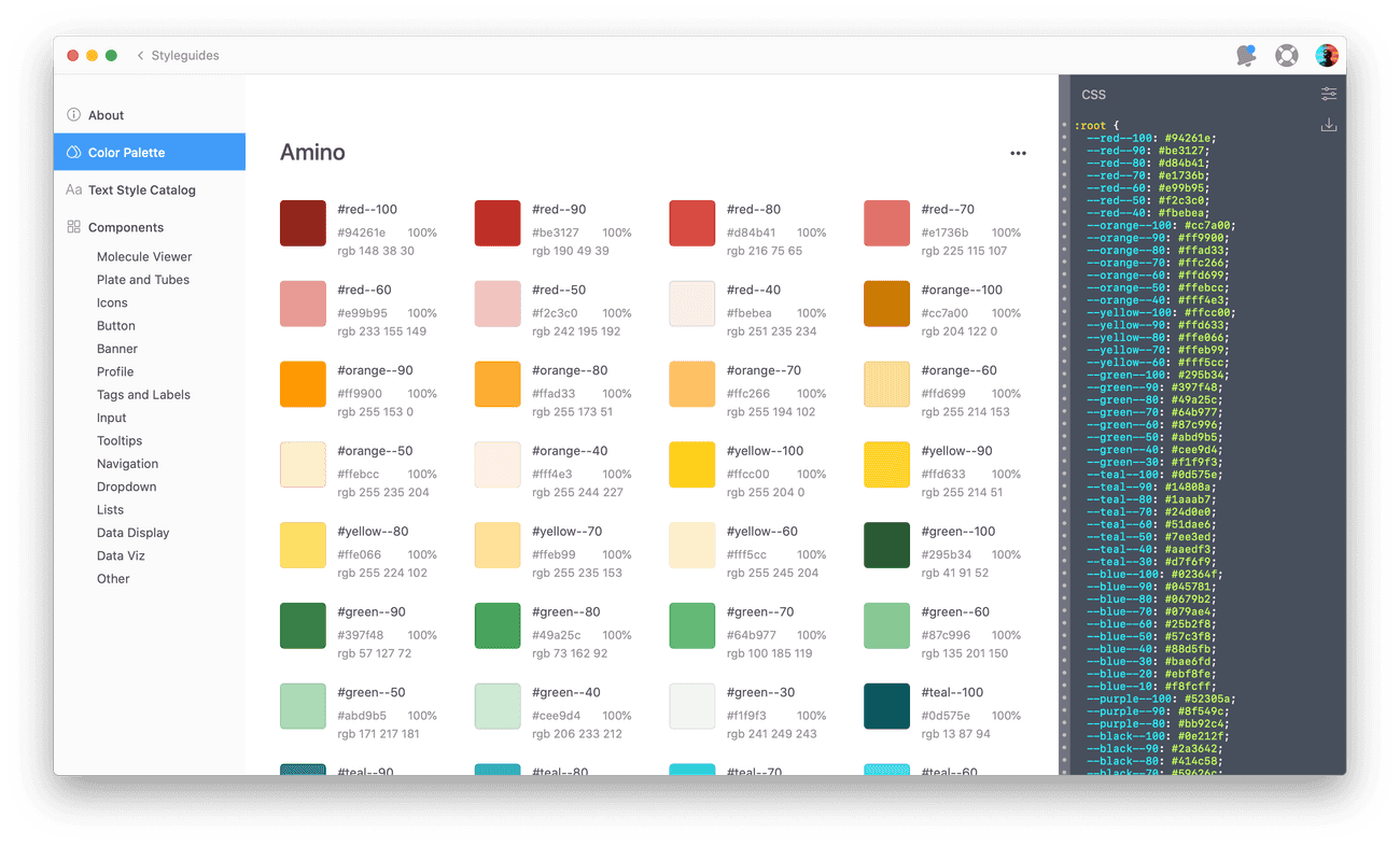
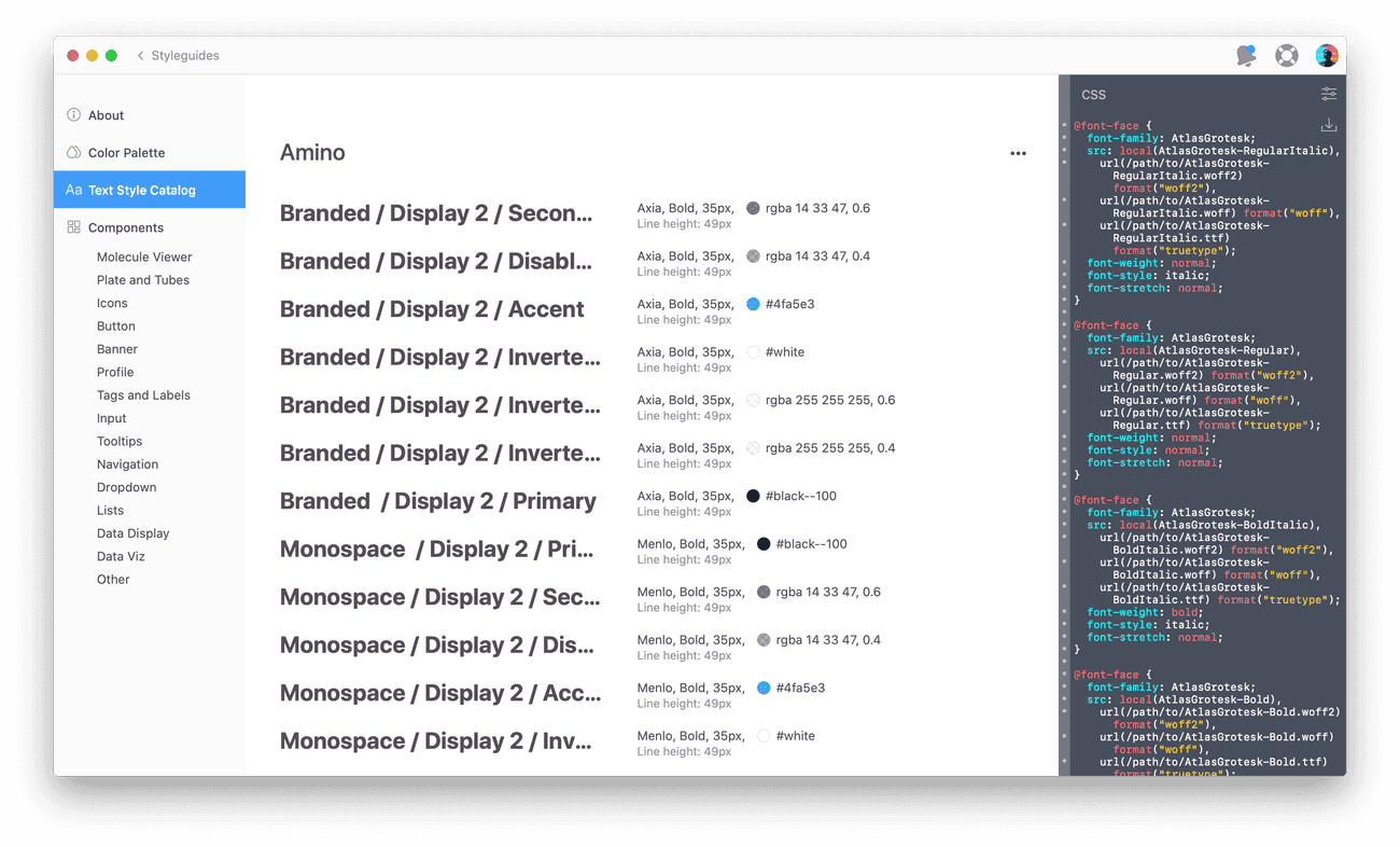
We use Zeplin Styleguides extensively to help engineers understand what colors, typography and components are used within mocks. Once we load these details from Sketch into Zeplin, it connects them to mocks – dramatically reducing the amount of redlines and manual documentation our Design team needs to create for handoff.
Connected Components
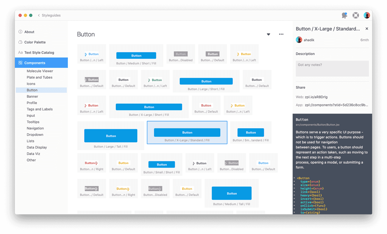
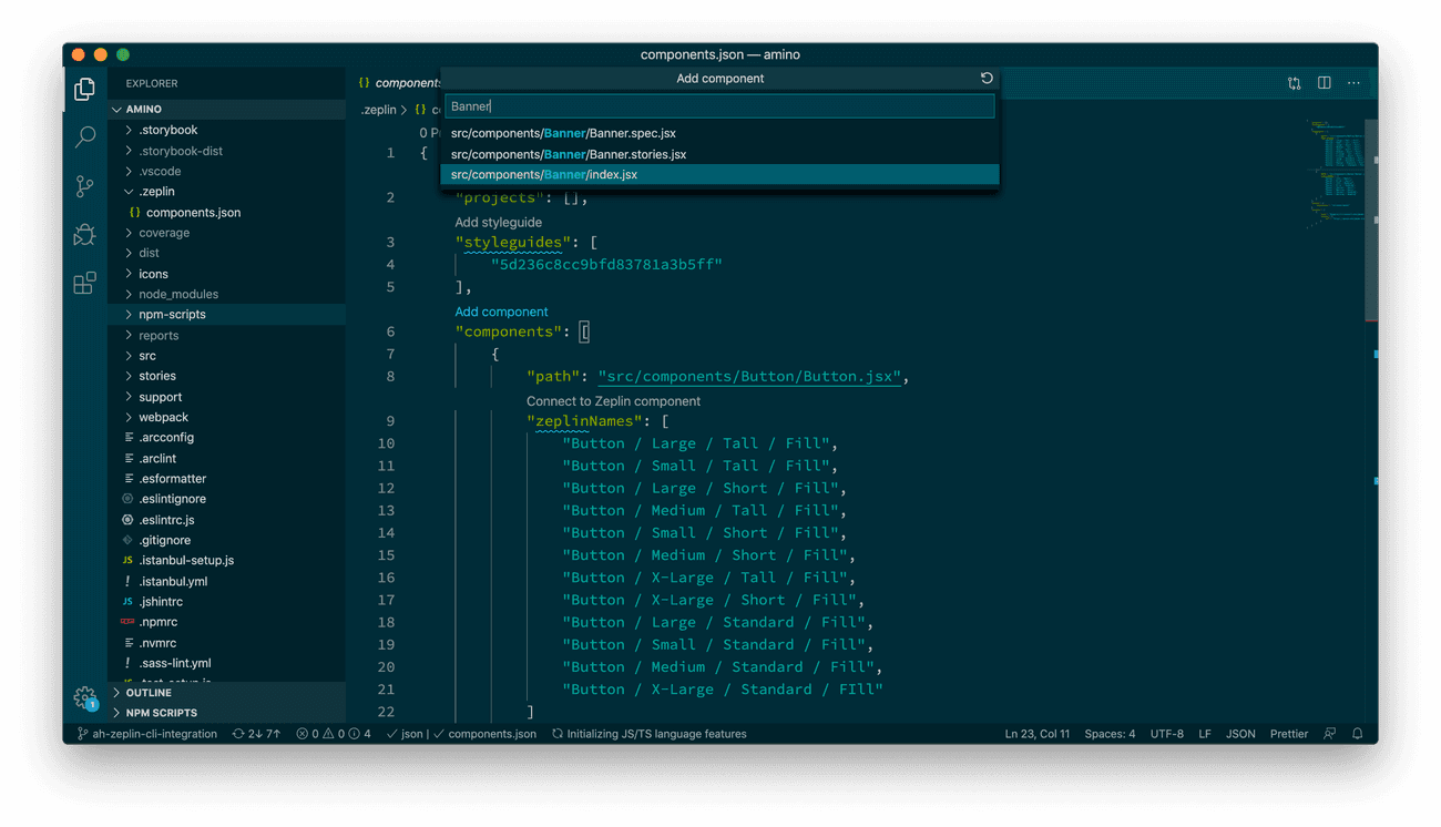
Zeplin's new Connected Components feature is an amazing way to let engineers see exactly which component is being used in a mock. It's a feature of the Zeplin CLI that uses a configuration file in the Amino codebase to connect components from a Zeplin Styleguide directly to the React code of those components. Magic! The configuration file looks something like this:
The Design team uses a handy VSCode extension to build out the configuration file, which is essentially a list of Amino's UI components. For each component, we provided the path to the React component and the name of the component in Sketch.
Every time we release a new version of Amino, our Jenkins pipeline triggers the Zeplin CLI to link our Sketch and React components together in Zeplin. The Zeplin CLI consumes the Zeplin configuration file, parses out code snippets and inline documentation for each React component, and sends the parsed information to Zeplin for display when inspecting mocks.
React and Sass
Amino's true source of truth its underlying code. Since the Design Team maintains the Amino codebase, we're able to ensure that each component and style is implemented perfectly. Amino is built as a React library, and we use Sass for our styling.
React
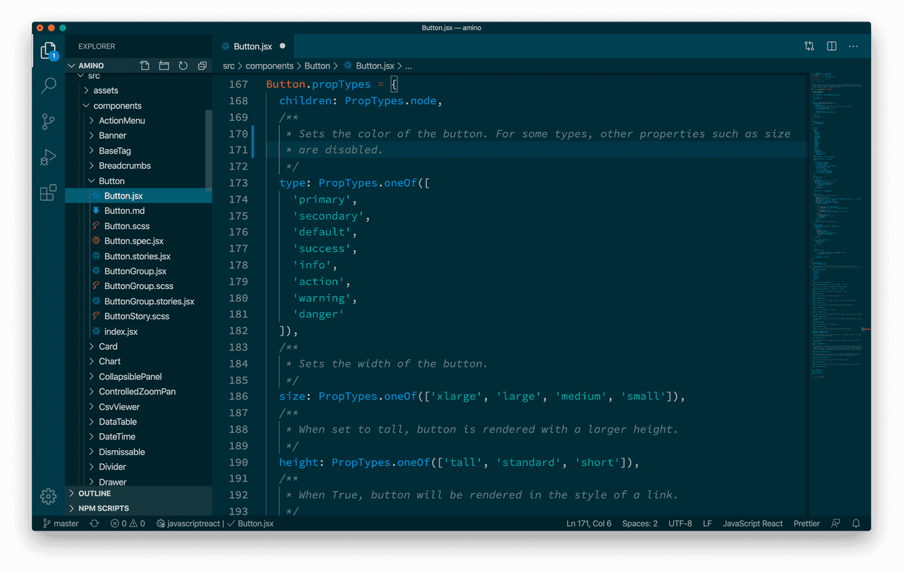
Every component in Amino is represented in JSX. There's nothing too crazy here – we build very standard React components. However we do adhere to some basic inline comment formats that help the Zeplin CLI, and our documentation site parse out notes for each component.
import React     from 'react';
import PropTypes from 'prop-types';

/**
 * This comment block gives a high-level overview of the component's
 * purpose. It should be focused on appropriate use of the component,
 * so that a developer knows if this is the right component for them
 * to use.
 */

class MyComponent extends React.Component {
  constructor(props) {
    super(props);

    // Component setup
  }

  render() {
    return (<div className="my-component" foo={this.props.bar} />);
  }
}

MyComponent.propTypes = {
  /**
   * This documentation describes what the bar prop does and what its
   * value is used for/how it effects the component.
   */
  bar: PropTypes.string.isRequired
}

export default MyComponent;
Sass
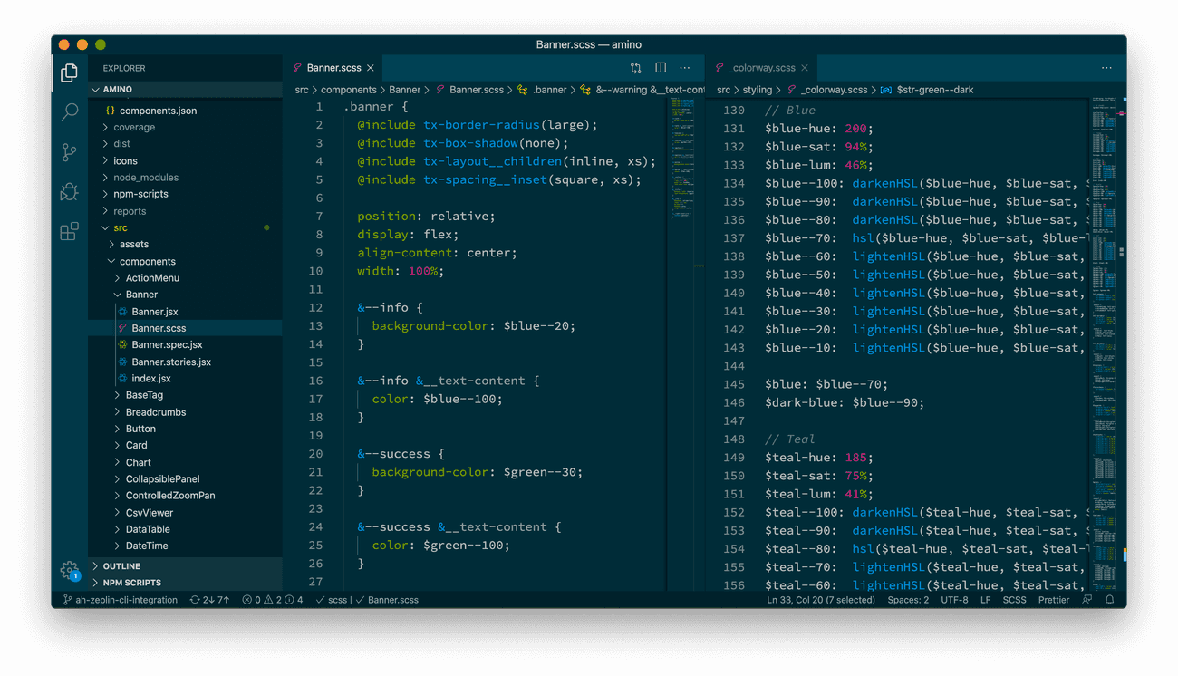
Alongside each React component sits the component's CSS styling, as a Sass file. These Sass files use many global variables and mixins that we maintain to help keep Amino's styling code succinct.
You can learn more about the Sass we developed to handle our system-wide styling in these articles:
Storybook
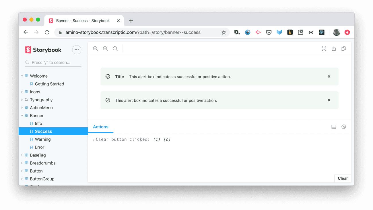
Since the Amino React Library doesn't have a UI of its own, we use Storybook as a sandbox for development. Storybook is a development server used to render Stories, each of which show a component in a certain state or context.
See the Amino Storybook Live HereIf we're adding a new component, or improving an existing one, we use Storybook to see the result of our code changes. Storybook is also an excellent tool to view and inspect a component without having to find it in use in a product.
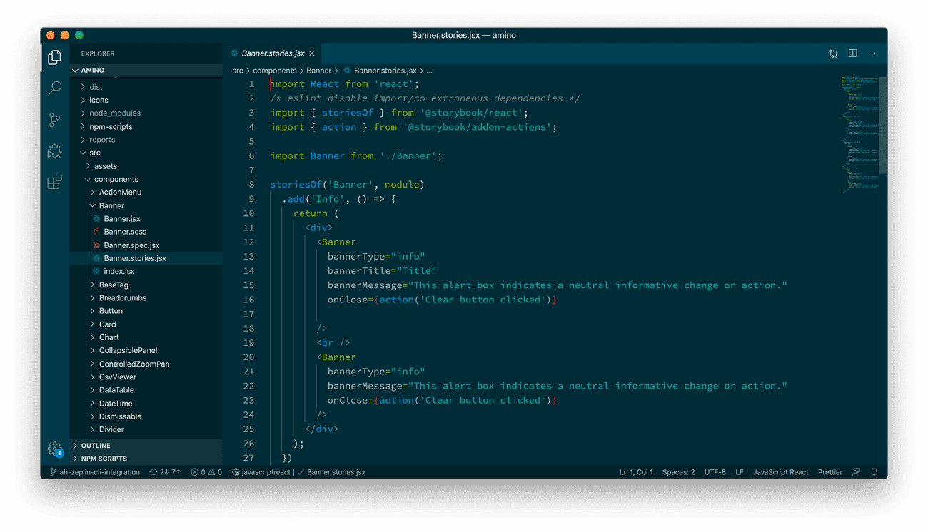
Stories are created by adding specially named JSX files alongside our React component files. Storybook automatically finds these files, and renders each in a separate view in a webapp.
Storybook provides a space to explore components in isolation from a product.
Chromatic
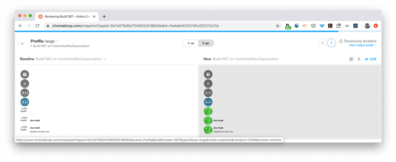
It's incredibly important that Amino be a trusted source of design standards – and as a result, we have built tooling to ensure that unintended visual side-effects and regressions are not introduced. We use Chromatic to run visual regression tests on all of the Stories we build out in Storybook.
Chromatic is part of our Continuous Integration, and runs every time a PR is put up on GitHub. It takes visual snapshots of every Storybook story, and compares them to snapshots from the most recent commit on Amino's master branch. If anything has changed, it flags it for further review by the design team. This ensures that in the process of building or fixing components, we don't accidentally introduce un-intended side-effects elsewhere in the codebase.
Chromatic has been instrumental in closing the gap between design and development on Amino. Not all of our designers code, but Chromatic pulls them into the code review process by allowing them to inspect and accept/deny visual changes.
Using Amino
We have have put in substantial effort to make the development of Amino as automated as possible. This work opens up possibilities downstream as well to offer tooling to the engineers who use Amino to implement new features.
Zeplin
Zeplin is an extremely powerful tool for engineers to use while implementing mocks. It is a visual communication channel for the Design Team whereby we can explain the design foundation of a mock to the Engineering team.
As mentioned above, we connect our Sketch and React components in Zeplin every time we release a new version of Amino. This allows Zeplin to expose the React code and documentation of each Amino component used in a mockup.
This contextual information is invaluable to engineers as they work – dramatically increasing the usability of Amino, and our product development velocity.
Documentation
The final tool Engineers use when building with Amino is the Amino Documentation Site.
The Amino Documentation Site is engineered from the ground up to remain up-to-date and in-sync with Amino as it grows and changes. We worked under the presumption that our thinly stretched design team would never be able to manually keep a documentation site updated.
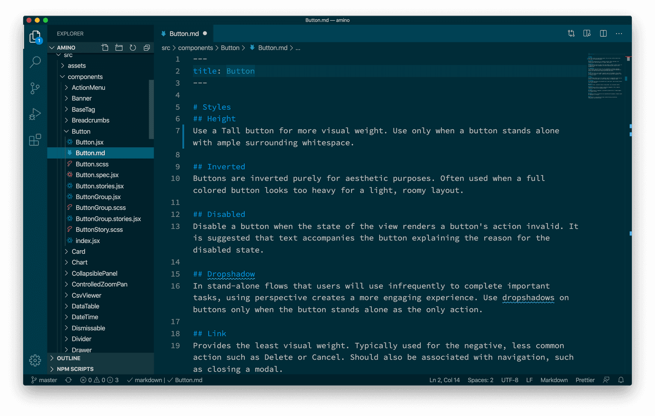
To achieve this, the site is built on Gatsby and consumes Amino as a dependency. It generates documentation based on the library's React and Sass code, and MarkDown files that accompany Amino components.
Making Amino's Styling Utilities Discoverable
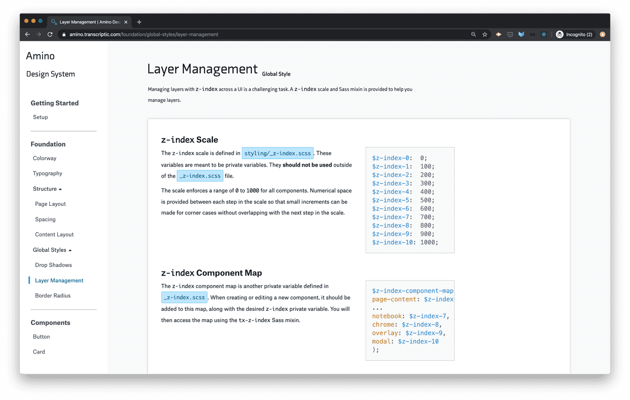
The first bit of the Documentation Site simply exposes the many Sass variables and mixins provided by Amino. More than just documenting these utilities though, the site seeks to explain why these utilities are provided and what proper use looks like.
Coupling Component Documentation and Code
We tightly couple our UI component documentation content to our React code. Every component in Amino is arranged in a directory structure like this:
components/
├── CoolComponent/
│   ├── index.js
│   ├── CoolComponent.jsx
│   ├── CoolComponent.scss
│   ├── CoolComponent.spec.jsx
│   ├── CoolComponent.stories.jsx
│   └── CoolComponent.md
In the component's JSX file, as described above, inline comments detail what the component should be used for and what its API is. Additional information about the component, such as more detailed usage guidelines, or demonstrations of various configurations are detailed in the component's MarkDown file.
Keeping both inline and more verbose documentation as part of the Amino repository elevates the importance of documentation to the same level as the underlying code. This means that documentation is reviewed alongside the code when a PR is created on GitHub.
Leveraging Amino's Coupled Documentation
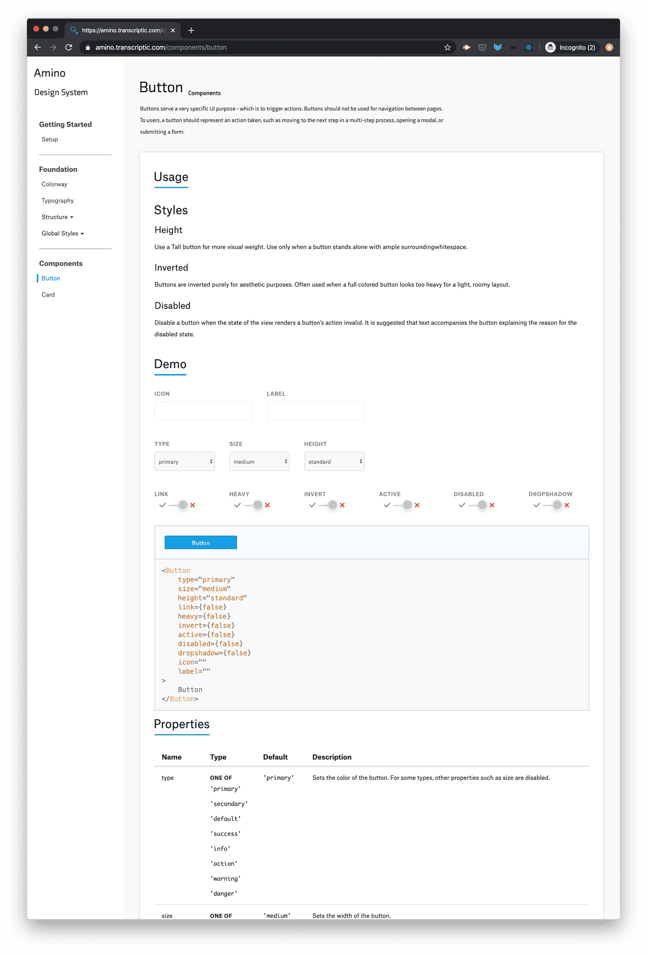
Since Amino's documentation lives in the codebase – updating and improving alongside the code – the Amino Documentation Site can simply consume and display this content. The site uses Gatsby's GraphQL utility to query the content of the component's JSX file, as well as its MarkDown file. We use a Gatsby template to parse the component's inline documentation and API definition, and combine it with the content of the MarkDown file to create a single documentation page for each component:
Each page has four parts:
- An overview of the component – parsed from the top of the JSX file.
- Detailed documentation that explains how and when a component should be used, and what its capabilities are – which is taken from the MarkDown file.
- An interactive demo of the component where the user can change the values for each prop – created dynamically from parsing the component's prop types.
- A table detailing what each property's type is, what default values are set (if any), and why the prop is exposed – parsed from inline documentation of the JSX file.
When an improvement is made to Amino, associated documentation is included in the same Pull Request. Every time a new version of Amino is released, we need only to upgrade the Amino dependency, and rebuild and deploy the site to deliver the updated documentation to our engineers.
In Review
The tooling surround Amino is extensive, however it multiplies the capacity of our limited design team many times over through automation, and deep integration with engineering workflows. If you'd like to learn more, these blog posts and case studies detail some of the technical challenges we overcame in bringing these tools online.
